
Dark mode has evolved from a developer preference to a consumer requirement. But simply inverting colors isn't enough. It requires a systematic approach to saturation, contrast, and depth.
1. Avoid Pure Black
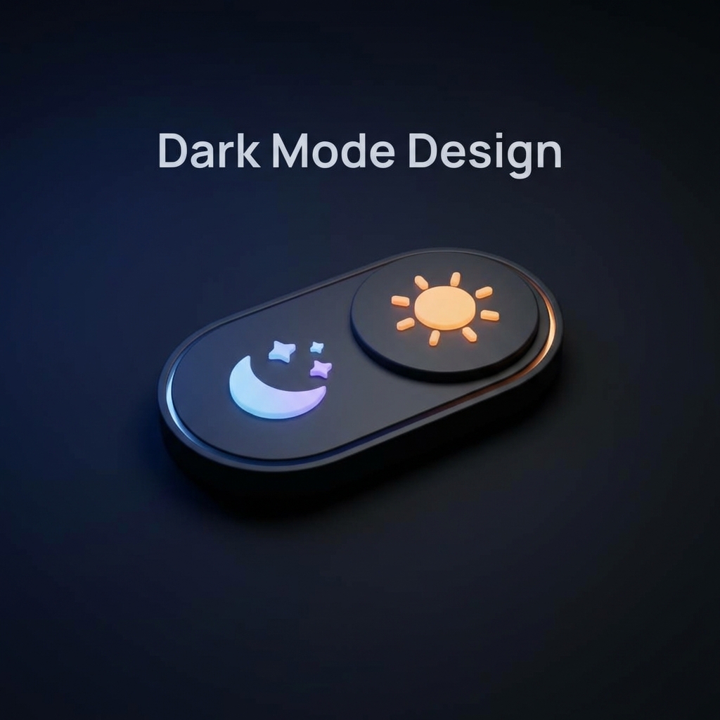
This is rule #1. Pure black (#000000) creates harsh contrast and can cause "smearing" on OLED screens. Instead, use dark greys or slightly tinted dark blues (like #0F172A). This softens the experience and reduces eye strain.
2. Desaturate Your Colors
Bright, vibrant colors that look great on white backgrounds can vibrate against dark grey. When designing for dark mode, lower the saturation and increase lightness slightly to make text legible and comfortable.
3. Elevation through Lightness
In light mode, we use shadows to show depth. In dark mode, shadows are invisible. Instead, we use "lightness" to indicate elevation. The "closer" an element is to the user (like a modal), the lighter surface color it should have.